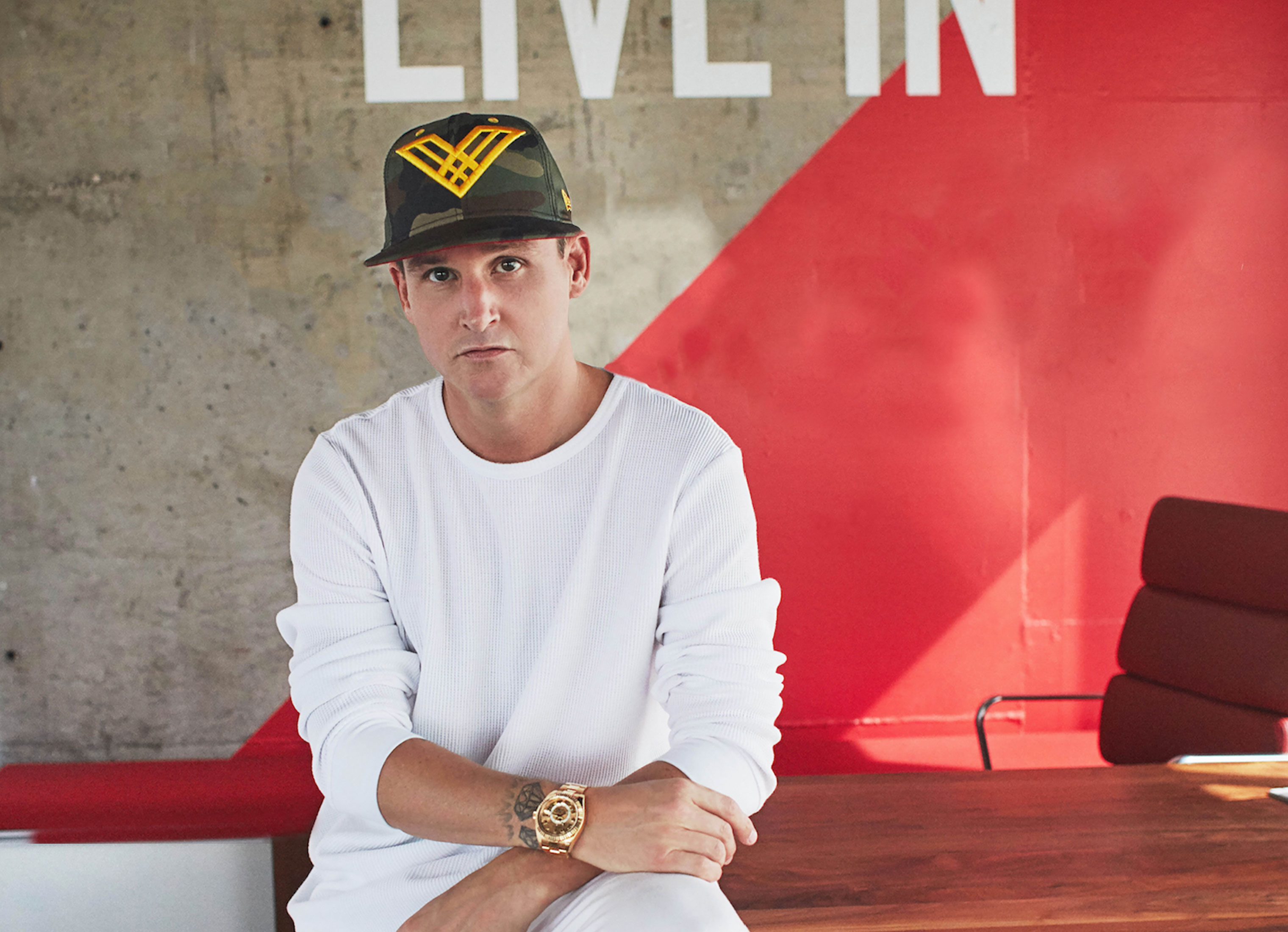
Rob Dyrdek
is an ex-pro skater, entrepreneur and pop-culture celebrity. We helped redesign his personal brand and sub-brands.
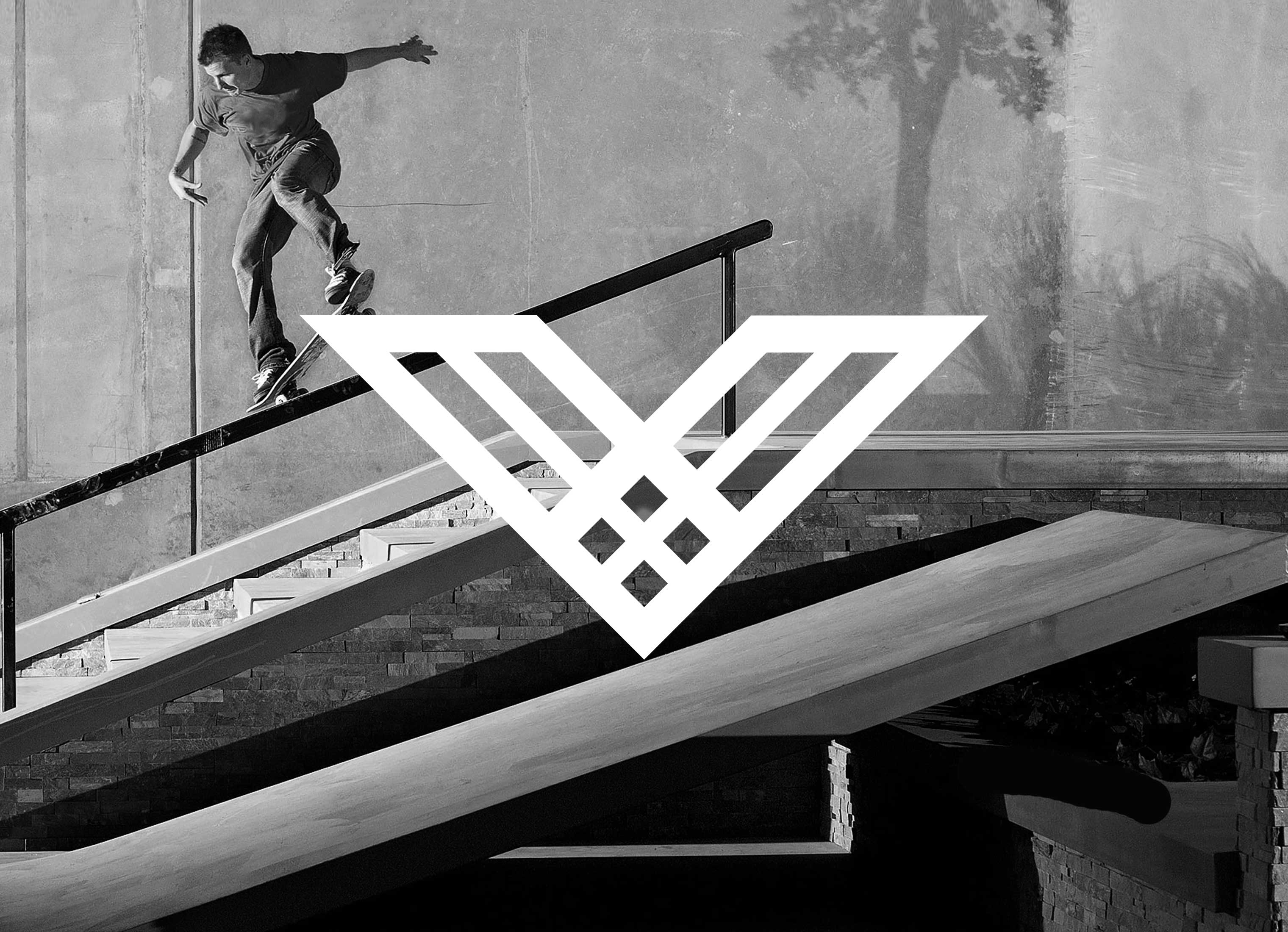
THE SYMBOL
The Dyrdek icon is made of six rays intersecting in a “V” formation. In the center are four diamonds, representing the four core attributes present in the Dyrdek audience. The "V" of the symbol reaches outward and upward, symbolizing ongoing passion & progress – Dyrdek's core strategy.
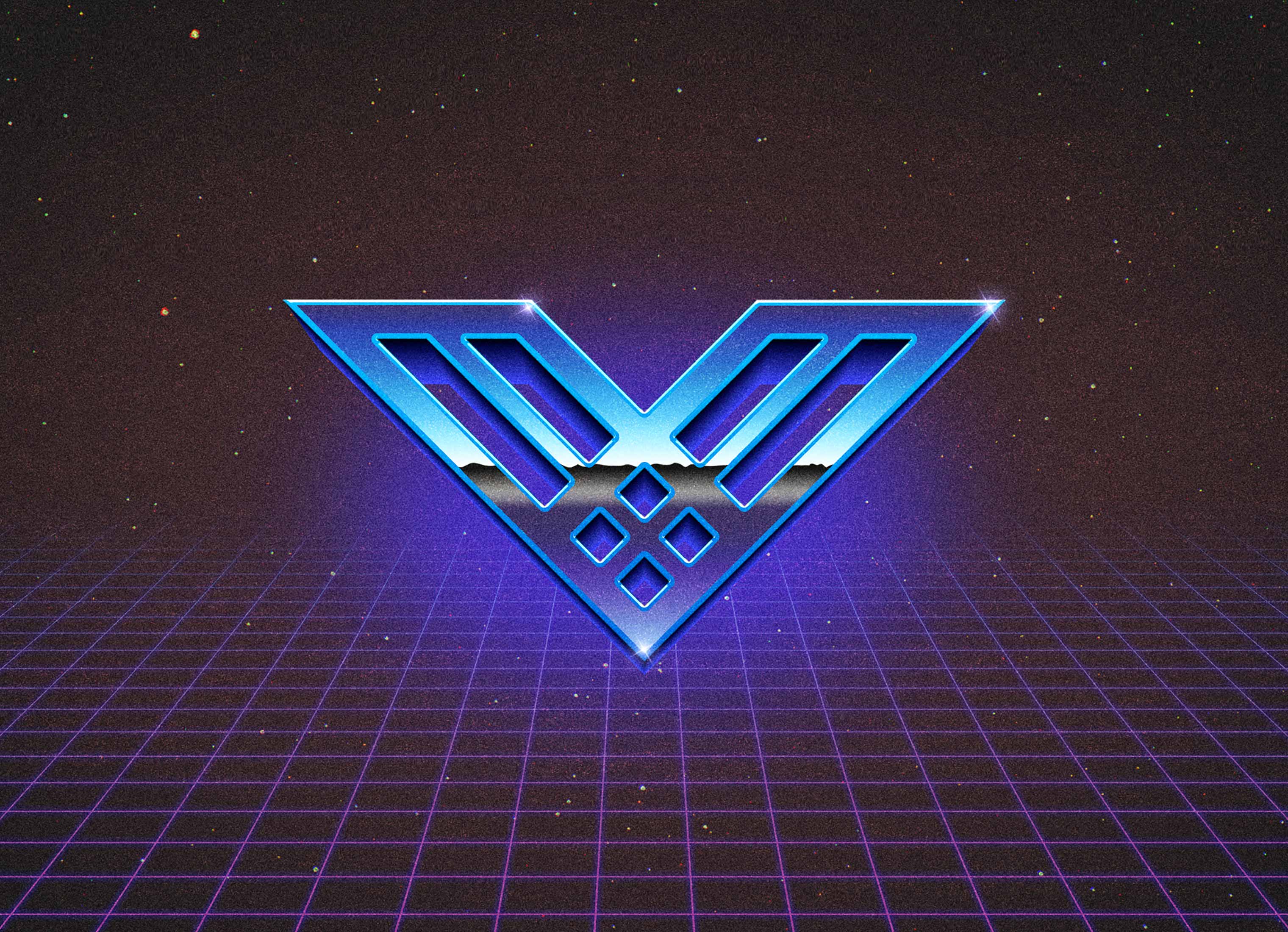
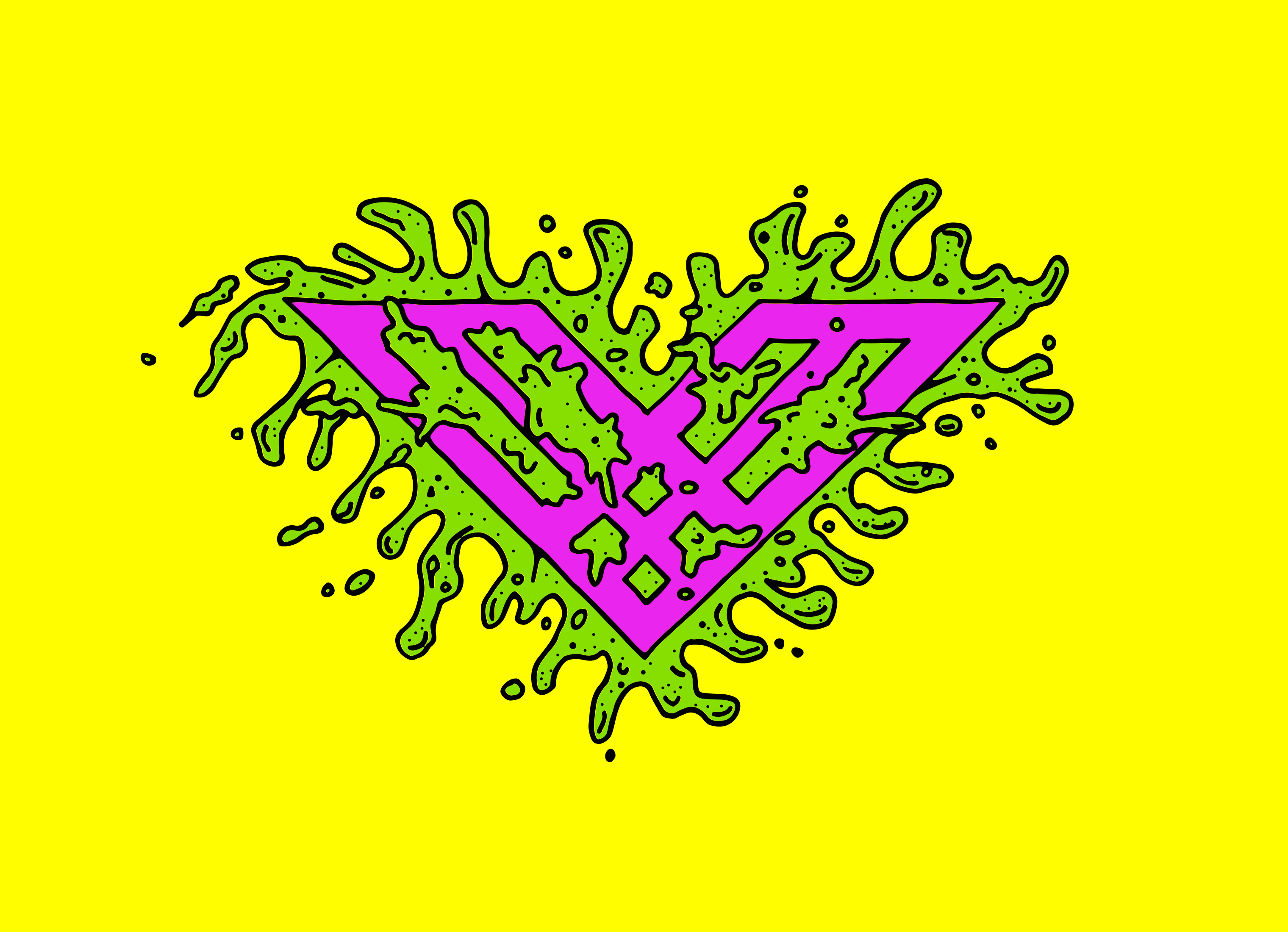
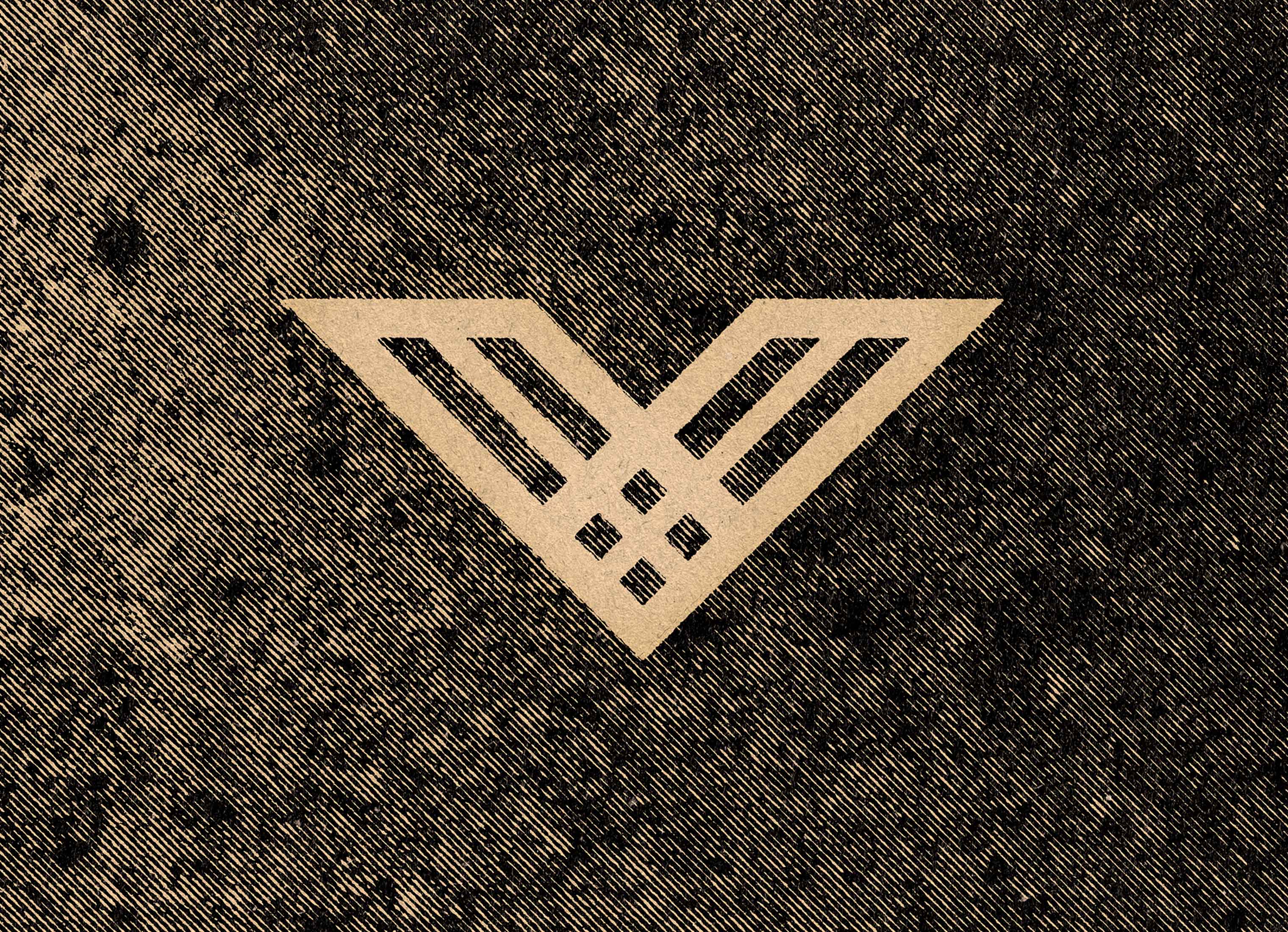
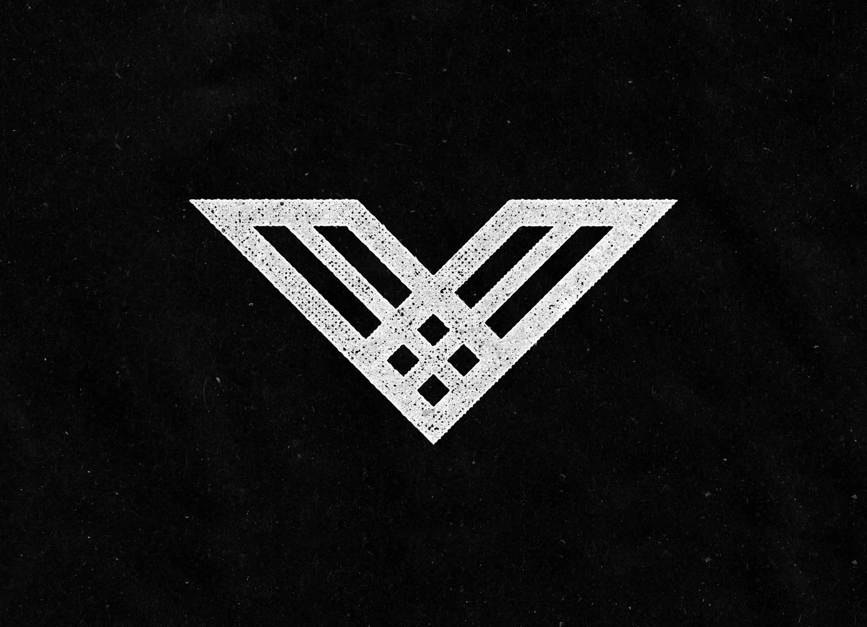
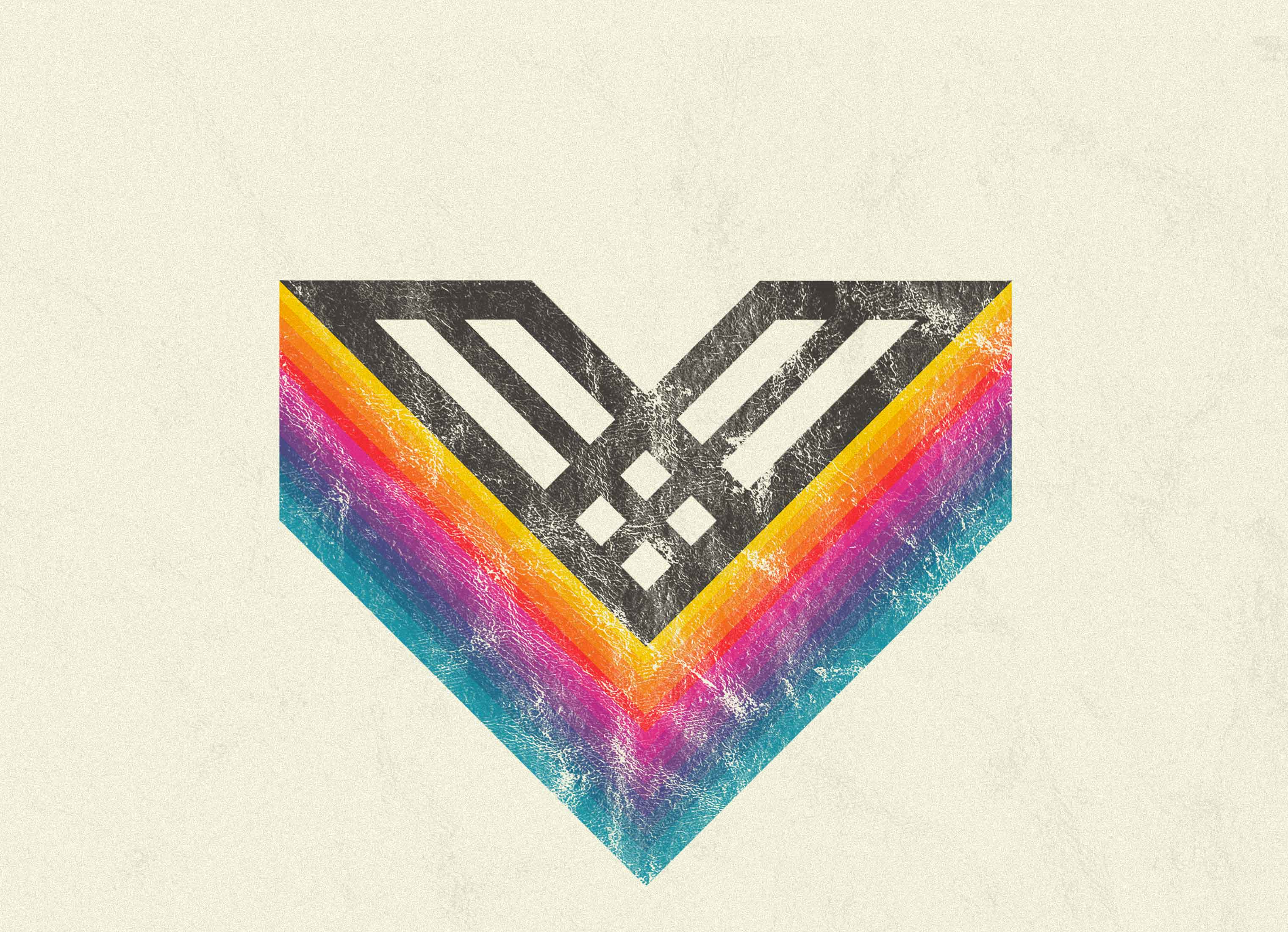
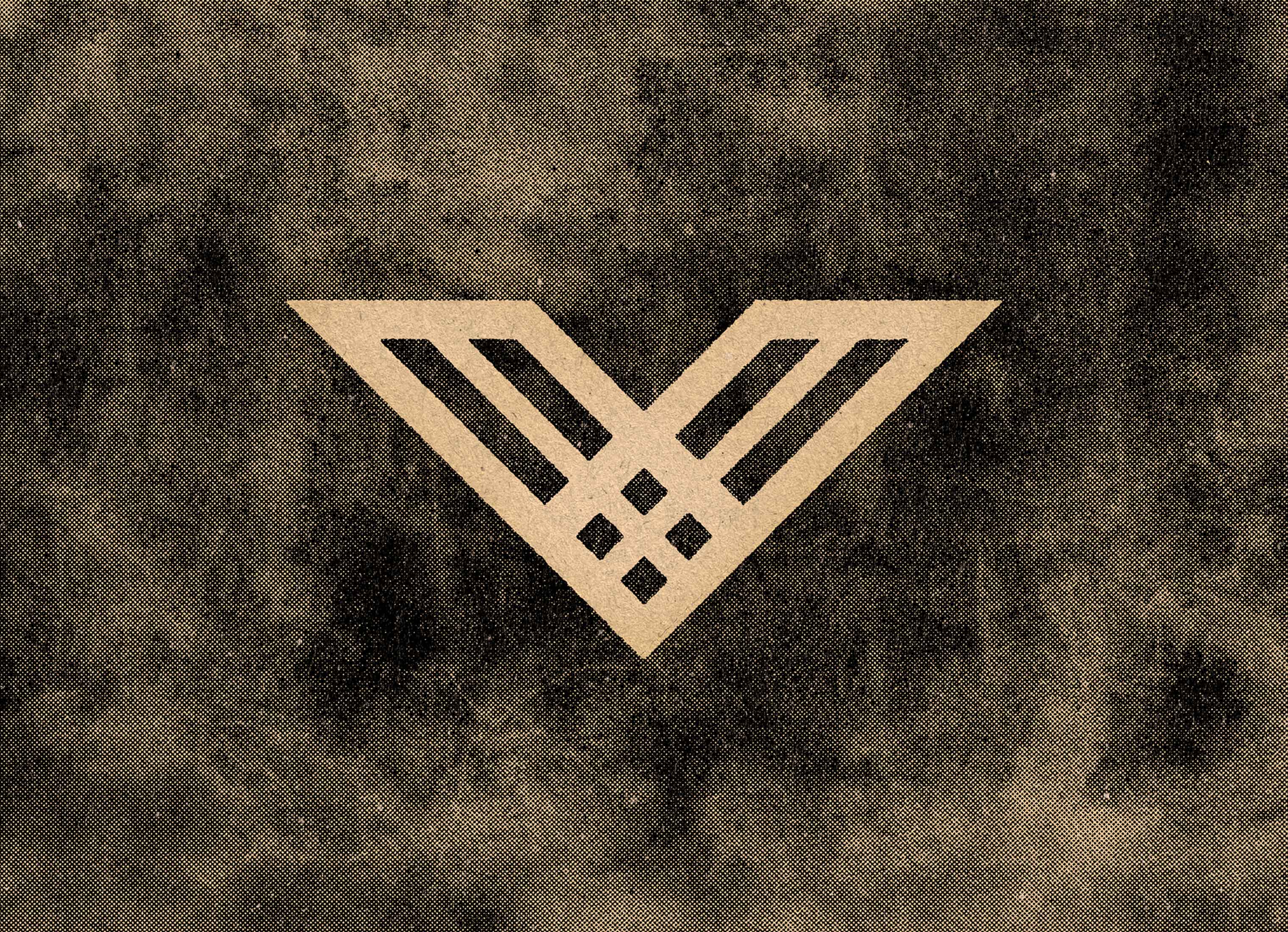
Fig 2.0
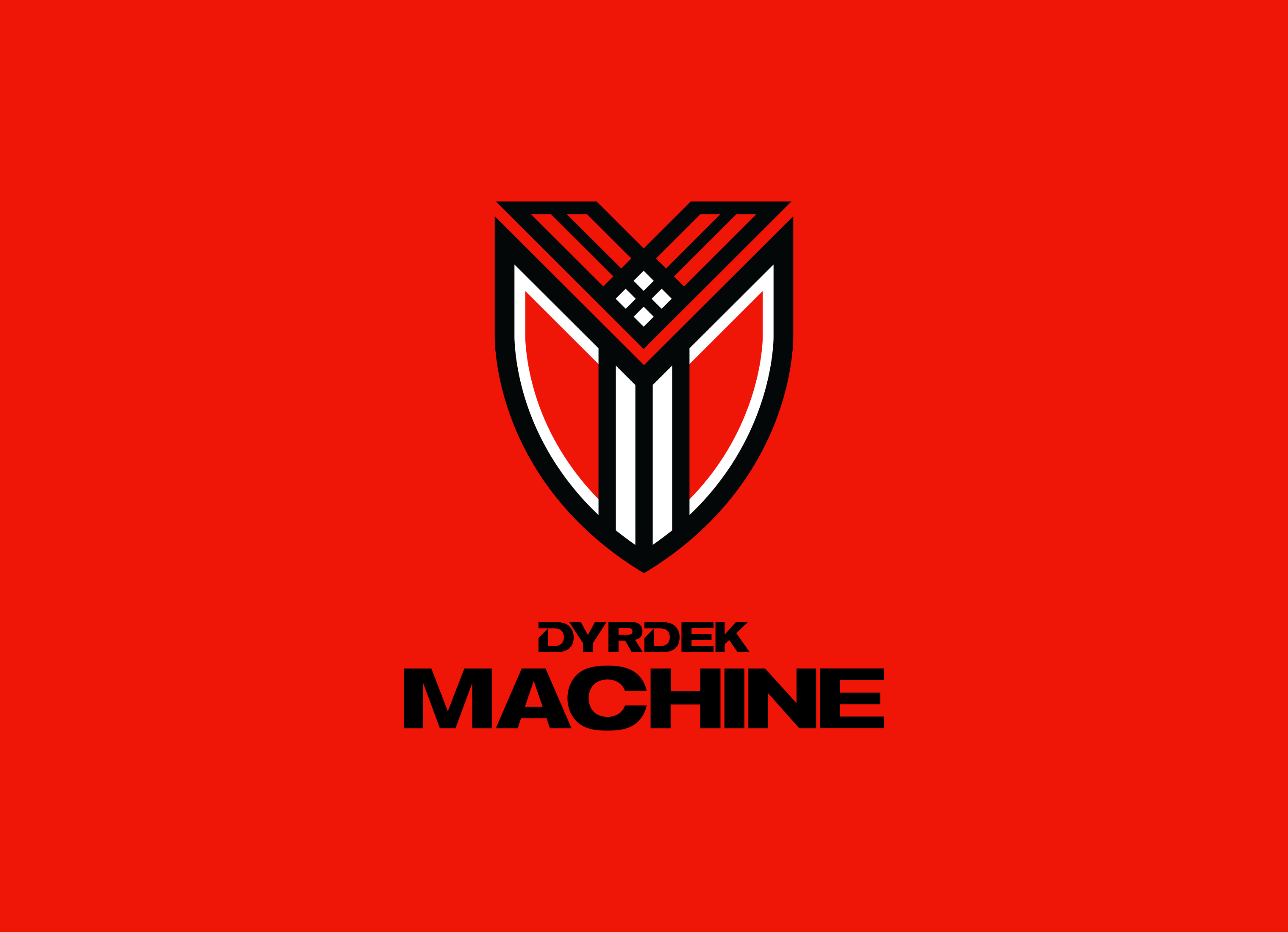
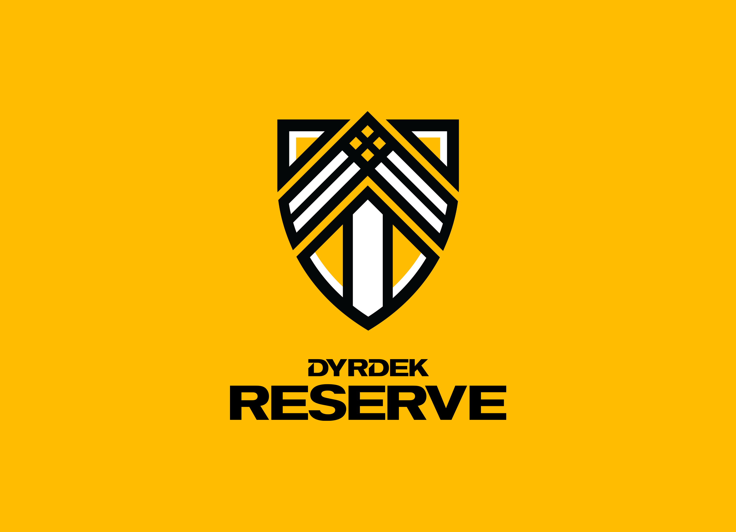
DYRDEK SUB-BRANDS
Rob wanted soccer-like crests for his sub-brands. Dyrdek Machine, is a venture studio, that invests in product ideas and helps brings those ideas to reality. The crest incorporates Rob's symbol within the crest design. Red is used as the primary brand color. Dyrdek Reserve, is Rob's charitable organization...we think? Oh, and that one is yellow.
Skills
- Brand Strategy
- Identity Design
- Visual Design System
- Brand Guidelines
- Iconography
- Kick Flipping
- Gigantic Skatedeckboarding
- McTwisting
Details
Team
- Garrick Willhite
- Alec Lindsey
- Bill Gunter
- Eric Drommerhausen
- Nikki Meyers
Client
- Rob Dyrdek
Project
- Brand Identity, Brand Guidelines
Year
- 2016